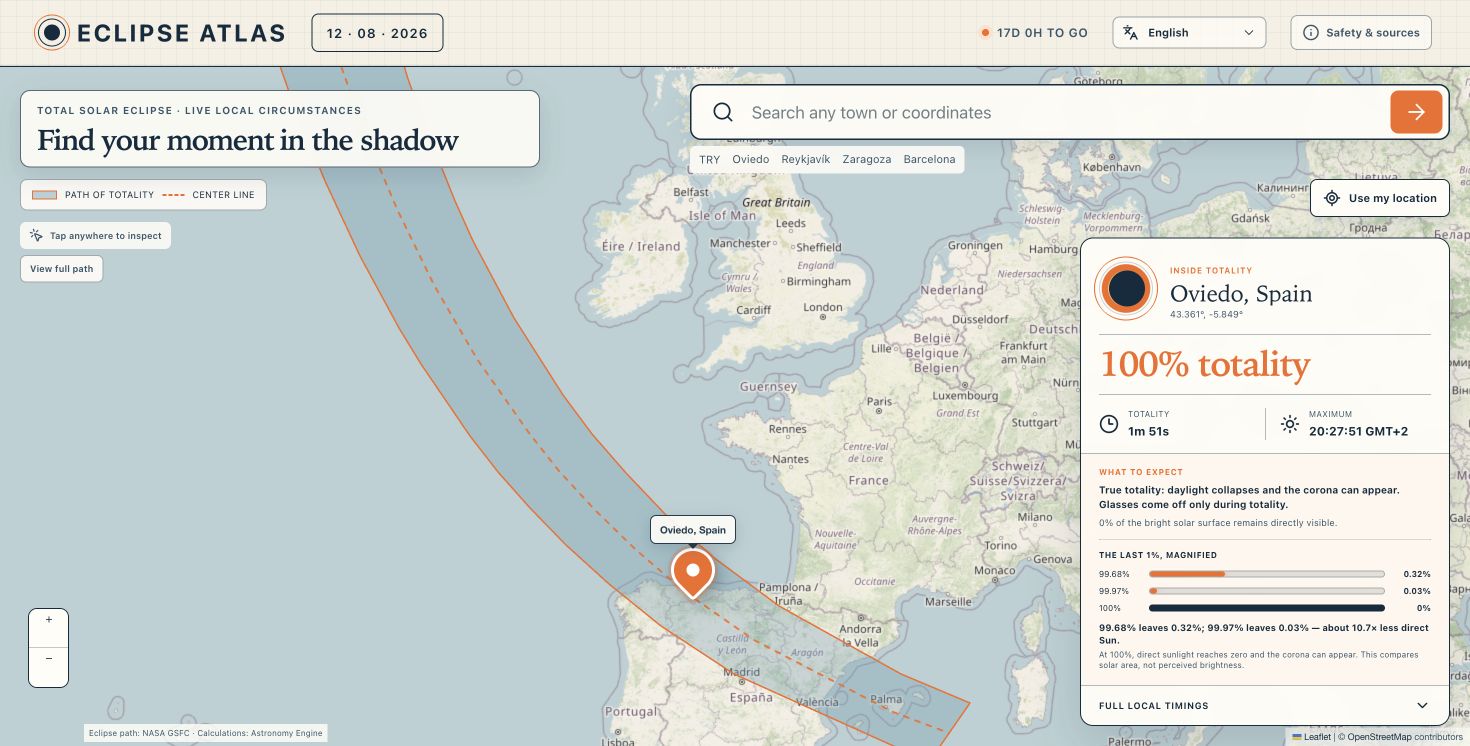
The total solar eclipse of 12 August 2026 will cross Greenland, Iceland, the Atlantic and northern Spain before ending in the Mediterranean. It will also pass close enough to millions of people that a deceptively simple question will become very common:
What will I actually see from where I am?
That question became Eclipse Atlas, an interactive map built through OpenAI Work and published with OpenAI Sites. Anyone can search for a town, use their current position or tap anywhere on the map to see the local eclipse coverage and timings.
The finished website looks simple. Getting there was not.
We published fourteen working versions while building it. Most of the important progress came after looking at the real site on real screens and noticing where our assumptions were wrong.
The original brief
The brief was to create a public website for the next solar eclipse on 12 August 2026. It needed to:
- Show the path of totality on a free map.
- Let people search for a place or use their current location.
- Calculate the maximum coverage and local contact times.
- Explain what the result would feel like, not only display a percentage.
- Work properly on mobile and desktop.
- Support the languages spoken along the eclipse path.
- Be publicly accessible and discoverable through search engines.
We chose OpenStreetMap rather than a commercial map provider. The product direction was a compact “field guide”: warm paper, a faint technical grid, dark navy typography and solar orange highlights. We deliberately postponed themes. One strong visual system was more useful than several unfinished ones.
What we built
Eclipse Atlas combines three kinds of information:
- Geography: the northern and southern limits of totality and the centre line.
- Astronomy: the local circumstances of the eclipse for an exact latitude and longitude.
- Human context: local civil time, the Sun’s altitude, safety guidance and an explanation of what the selected coverage means.
The interaction is intentionally direct:
Search, geolocation or map tap
                ↓
        Latitude and longitude
                ↓
   Eclipse calculation + time zone
                ↓
 Coverage, local times, Sun altitude
                ↓
       A plain-language result
The main technical ingredients are:
- React and Next.js for the application and localized routes.
- Leaflet for map interaction.
- OpenStreetMap tiles and attribution.
- NASA GSFC data for the predicted path of totality.
- Astronomy Engine for local eclipse circumstances.
- Time-zone lookup and the browser’s internationalization APIs for local civil time.
- A small server-side geocoding endpoint for place search.
There is no account system, paywall or database. The website is public and free to use.
The map had to become the product
Our earliest desktop layout treated the introduction and search form like a conventional hero section. The result looked reasonable in isolation, but it consumed roughly a third of the vertical viewport before the map even began.
That was the wrong hierarchy.
The map is not supporting media for this website. It is the website.
We moved the heading and search form into compact floating cards over the map. On desktop, the map now begins immediately below the slim header and occupies almost the entire remaining viewport. The local result sits in a card over the lower-right corner. Controls and the path legend stay close to the map edges.
Mobile needed a different composition. The first mobile version was wider than the screen, the selected position was difficult to understand and the result card covered too much of the map. We changed it to a vertical flow:
- A compact heading and search area.
- A dedicated map viewport with the selected marker clearly visible.
- The result card below the map rather than floating over it.
This was not a matter of making the desktop version smaller. Mobile required a different information hierarchy.
Correcting the eclipse path
The most serious early problem was not visual. It was factual.
An early representation of the eclipse band was incomplete and created confusing situations: the map could appear to place a selected point inside the path while the astronomical calculation reported a 99.97% partial eclipse. The path also appeared to stop in the wrong places, raising reasonable questions about Greenland and Mallorca.
For an ordinary decorative map, a slightly approximate line might be acceptable. For an eclipse map, a small geographical error changes the answer from partial eclipse to totality. That is the difference between seeing a thin solar sliver and seeing the corona.
We replaced the approximation with the published NASA GSFC path data:
- The northern limit of totality.
- The southern limit of totality.
- The centre line.
The two limits form the shaded polygon; the centre line is shown separately as a dashed line. The local result is calculated independently from the selected coordinates. The visual path and the numerical answer now derive from authoritative eclipse data rather than from a hand-drawn approximation.
This was the clearest lesson of the project: in a scientific interface, visual polish cannot compensate for uncertain geometry.
Why 99.97% is not “basically total”
Coverage percentages created the most interesting communication problem.
To most people, 99.68%, 99.97% and 100% sound almost identical. In normal product metrics, the difference between them would be tiny. During a solar eclipse, it is not.
At 99.68% coverage, 0.32% of the bright solar surface remains visible. At 99.97%, 0.03% remains visible—about 10.7 times less direct solar surface. But both are still partial eclipses. The photosphere is extraordinarily bright, the corona does not appear as it does during totality, and eclipse glasses must stay on.
At 100%, the remaining directly visible photosphere reaches zero. Daylight changes dramatically and the solar corona can become visible. Only observers inside the path of totality may remove eye protection, and only during the total phase.
Displaying a larger percentage was not enough, so we added a “last 1%, magnified” explanation. It compares the remaining bright solar area at 99.68%, 99.97% and 100%, accompanied by a plain-language description of the expected experience.
That small component became one of the most important parts of the product. It translates a mathematically small difference into an experientially enormous one.
Local calculations instead of static city tables
The website does not rely on a fixed list of cities. Every search result or map tap produces coordinates, and those coordinates drive the calculation.
For each selected point, Eclipse Atlas determines:
- Whether the eclipse is total, partial or not visible.
- Maximum coverage.
- The beginning and end of the partial phase.
- The beginning and end of totality where applicable.
- The time of maximum eclipse.
- Totality duration.
- The Sun’s altitude for each event.
- The correct local civil time zone.
The Sun’s altitude matters particularly in Spain, where the eclipse happens close to sunset. A technically visible eclipse can still be difficult to observe if buildings, mountains or trees block the western horizon. The interface therefore warns the user when the Sun will be very low.
Fixing the default view and selected position
At one point, we correctly displayed “Oviedo, Spain” in the result card while the initial map viewport was centred much farther north. The marker and the map’s story disagreed.
The cause was a split between the initial map view and the selected-location state. We corrected the initialization and recentering logic so that:
- The default desktop view shows the useful European section of the full path.
- The selected marker and result always describe the same coordinates.
- Choosing a search result or tapping the map recentres at an appropriate zoom.
- Mobile gives the marker enough space to remain clearly visible.
- A separate “View full path” control lets users deliberately zoom back out.
This is a subtle map-design principle: a correct coordinate is not enough. The viewport must make the coordinate understandable.
Localization changed the architecture
The first localization pass translated the interface in the browser. A language selector changed the text, but every language shared the same URL.
That worked for a person already on the page, but it was incomplete for search engines and for sharing. Google might only discover the default version, and a Spanish visitor could not share a URL that reliably opened in Spanish.
We changed the architecture so each language has its own crawlable route:
/en— English/es— Spanish/ca— Catalan and Valencian/pt— Portuguese/is— Icelandic/da— Danish/kl— Greenlandic/ru— Russian/eu— Basque/gl— Galician/ast— Asturian
Each route now renders localized visible content from the start and includes:
- A localized page title and meta description.
- The correct HTML language.
- A self-referencing canonical URL.
- Reciprocal
hreflanglinks to every translation. - An
x-defaultfallback. - Localized Open Graph and social metadata.
- Localized structured data.
- Inclusion in the XML sitemap.
The language selector navigates between real routes instead of only changing client-side state.
Localization also exposed a visual issue. Text lengths vary considerably, and the Spanish headline overflowed its floating card. We added translation-aware title sizing, balanced wrapping and safer break behaviour. Short translations retain the large editorial type; longer ones scale down just enough to remain inside the component. This is why localization must be tested as layout, not treated as a final copy-replacement exercise.
Making the site public and searchable
Once the experience worked, we added the less visible parts required for a real public web property:
- Descriptive titles and summaries.
- Canonical URLs.
- Indexing and crawler directives.
- An XML sitemap containing every language route.
- Structured data describing the web application and eclipse.
- A social sharing card.
- A favicon and web-app manifest.
- Google Search Console ownership verification.
The OpenAI Sites access policy was also changed to public, so opening the site does not require a ChatGPT account.
SEO was not a single final checkbox. The first SEO pass was appropriate for one English URL; introducing language-specific routes meant revisiting metadata, canonicals, alternate links, structured data and the sitemap as one connected system.
Designing through real screenshots
The most useful testing tool was not an abstract checklist. It was screenshots from the actual site.
They revealed problems that were easy to miss while looking at individual components:
- The mobile page was wider than the device.
- The map marker was obscured or visually ambiguous.
- Search and introductory copy took too much vertical space.
- The desktop hero competed with the map.
- The map viewport did not match the selected result.
- Long translated headlines escaped their containers.
Each screenshot gave us a concrete failure to correct. The conversation moved repeatedly from “this is implemented” to “this is not yet understandable.” That distinction improved the product.
What we would do differently
If we started again, we would make several decisions earlier.
Begin with authoritative geometry
The NASA path limits should have been the first map layer, not a later correction. A small geographical approximation can invalidate the central promise of the product.
Test known edge locations
We would create a small set of reference coordinates from the beginning:
- Safely inside totality.
- Just inside each limit.
- Just outside each limit.
- Deep partial eclipse.
- Below the horizon.
Those points would become automated regression tests for both classification and map geometry.
Design mobile as its own composition
The map, marker and result should have been prioritized on a narrow screen before refining the desktop hero. Starting with the real information hierarchy would have prevented the early overflow and occlusion problems.
Use route-based localization from day one
Language affects URLs, metadata, navigation, structured data and layout. Treating it initially as client-side text replacement created avoidable rework.
Stress-test the longest strings
Responsive testing should include both viewport extremes and language extremes. A component that fits “English” may fail with “Seguridad y fuentes” or a longer scientific explanation.
Explain the experience, not only the number
The coverage visualization should have been part of the original brief. Users do not come to an eclipse map to collect a percentage; they want to understand what the sky will look like.
What worked well
Several decisions held up throughout the iterations.
The field-guide visual language gave the project a distinct identity without making the interface feel like a generic technology dashboard. OpenStreetMap and Leaflet kept the map open and lightweight. Calculating from coordinates made the product useful well beyond a small list of featured cities. The result card kept the essential information close to the selected point. Most importantly, the willingness to revise structural decisions—rather than only polish them—allowed the website to improve quickly.
Fourteen deployed versions may sound excessive for a small site. In practice, the checkpoints made iteration safer. Each meaningful correction could be built, validated, published and inspected without waiting for a hypothetical perfect release.
The main lesson
Eclipse Atlas began as a map with a search box. It became a lesson in how factual accuracy, interaction design, responsive layout, localization and search architecture depend on one another.
The hardest problems were not writing the map code or drawing the orange line. They were deciding what the line meant, ensuring it agreed with the calculation, giving the map enough room, and explaining why 99.97% is still fundamentally different from totality.
Small web projects are often described as quick because they have few pages. That can be misleading. A one-page tool can still contain geography, astronomy, time zones, safety guidance, responsive design and eleven languages.
The page count was small. The problem was not.